Helping one of Germany’s most recognized research institutes to trace innovation
The Challenge
A geographical visualization that helps comprehend the distribution and evolution of knowledge tradition.
The Result
An interactive topographical visualization that works as a tool for researchers and the general audience.
Our Expertise
- Data Visualization
- UX & UI Design
- Map-Making
The Brief
Tracing innovation
The Max-Planck Institute has a world-leading reputation as a science and technology research organization. We continuously develop interactive and visual research and communication tools in our ongoing collaboration with the institute.
Our previous tool, The Atlas of Innovation, helped researchers understand the distribution of inventions.
This time, the challenge was to map innovation through Europe, tracked by the reproduction of one book: The Sphere (De sphaera mundi) by Johannes de Sacrobosco – an elementary text on geocentric cosmology.
Our Approach
Layout
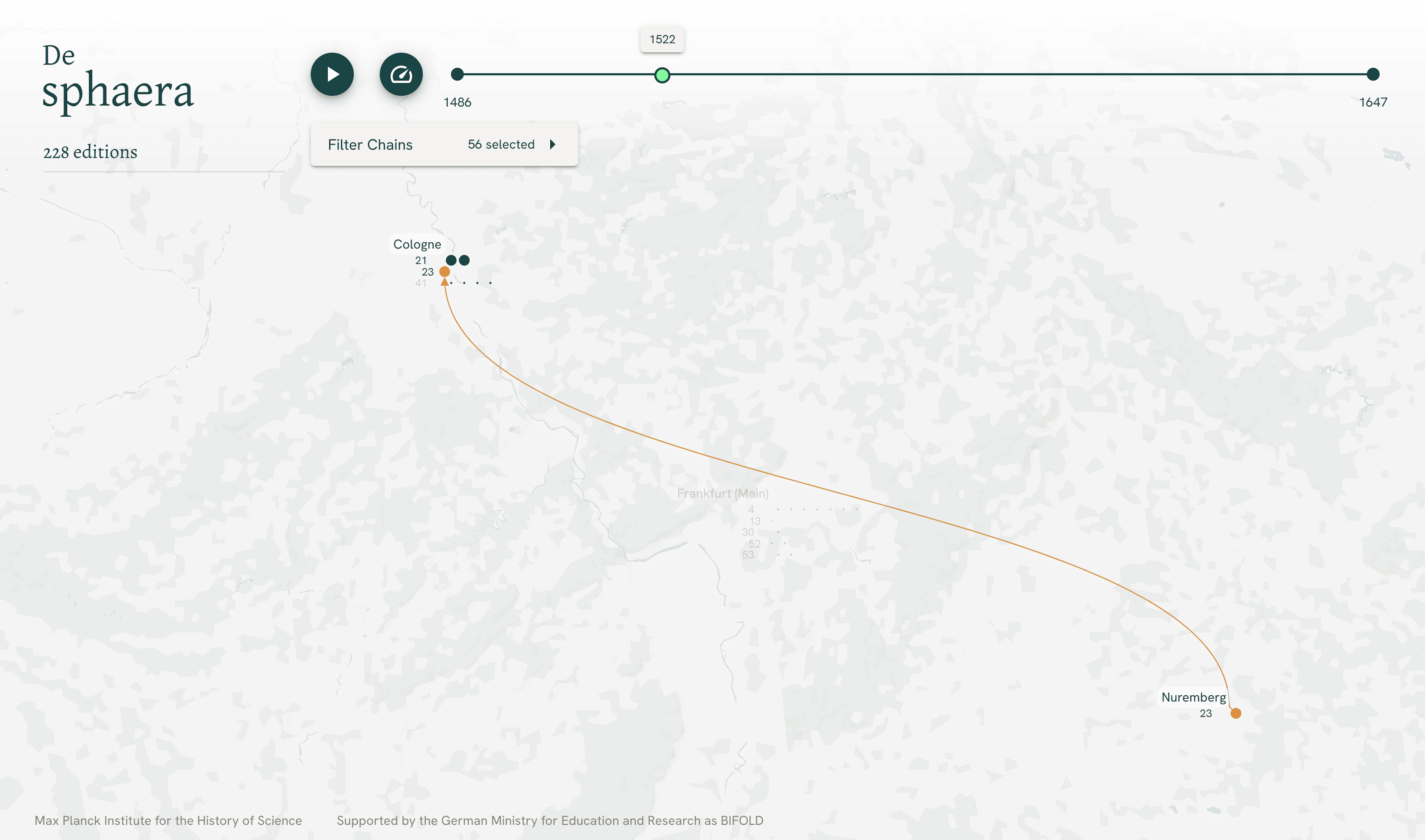
The dataset contained a high concentration of points in dense areas, such as northern Italy being a scientific epicenter at a time. Our experts designed an overlap-free and readable layout where the paths communicate direction and movement. We also maintained readability while zooming, not constraining user interactions.
Timeline animation
We designed a user experience that allows the researchers to playback (and loop) a selected time range of interest at various speeds to understand the data distribution. In this case, editions of the book.
Geographical animation
Every time a new edition of the sphaera was created, knowledge was populated. The distribution of knowledge is visualized via paths that display the travel over time. Those paths are animated and can be played back via the timeline animation.
Meta information
To allow researchers to compare fingerprint chains, we provided insightful measurements tools for each edition and chain. This way, one can spot significant differences in publishing intervals and the average speed of distribution.
Process
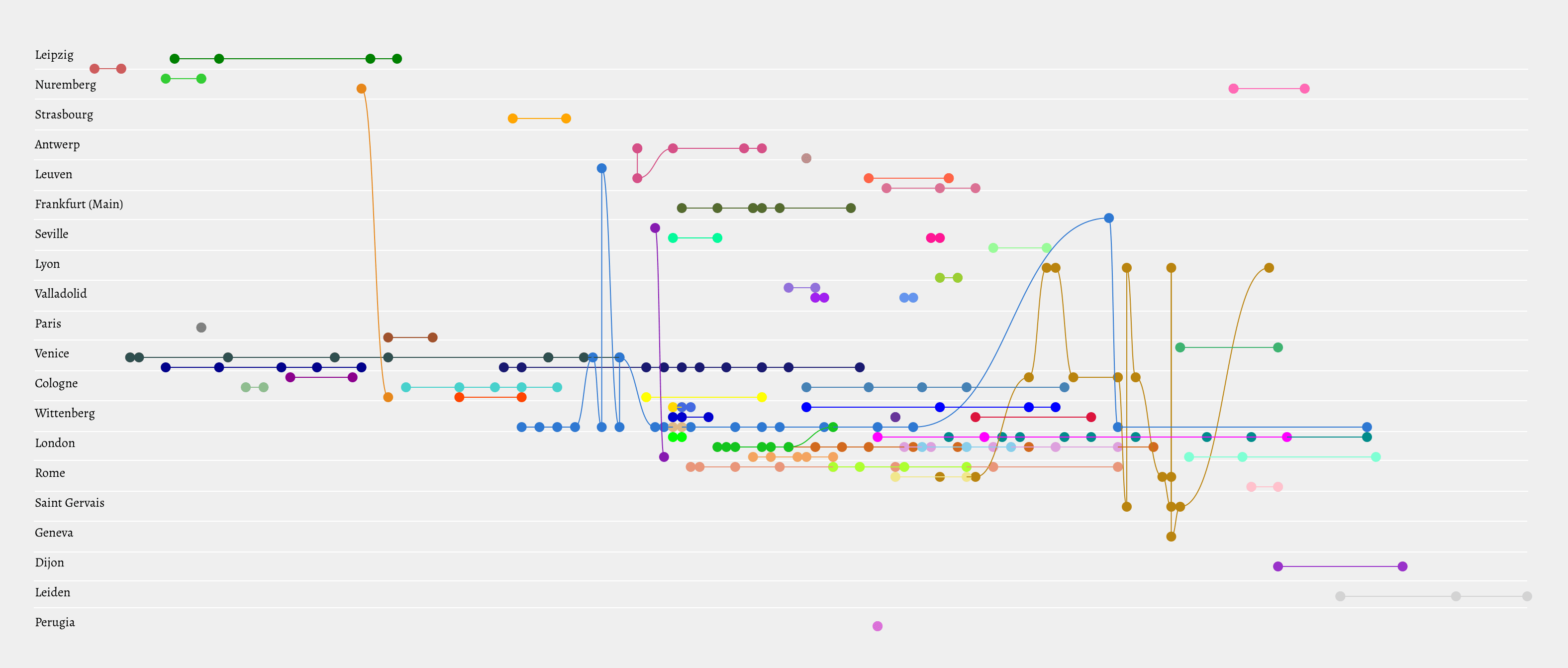
At NAND we start a data visualization project with an explorative phase to visually research an adequate representation for a specific data set. In this case, we designed also timeline representations inspired by music notation.
The advantage
Preserving the time differences between editions showing a chains' pulse.
Spot quiet times and publications-dense periods.
The result is an overview of how dynamic a city was in republishing and the parallelism of publishing activism.
Background
Ancient knowledge was significantly reshaped by introducing new content and by duplicating this content in innovative ways. This transformation process was driven by new printing techniques such as mechanical movable-type printing.
The Sphere (De sphaera mundi) was in the center of attention: Over 350 editions of Sacrobosco’s book were printed and enlarged in Europe. It became a mandatory course in all European universities until the seventeenth century.
More information about the project can be found here. The project is open source and hosted on GitLab.
Credits
The project was initiated by Matteo Valleriani, Kim Pham, Hassan El-Hajj at the Max Planck Institute for the History of Science.
Supported by the German Federal Ministry of Education and Research
Related Case Studies
View more data visualizations and information interfaces.
A visual interface to California’s energy consumption data
Collaborate with us
Lets find out how we can add value to your business:
Visit us
Our Studio in Berlin
Sophienstr. 18
10178 Berlin
Legal Disclaimer
Privacy Policy