Visualizing scientific data about the harm and benefit of vaccination against COVID-19
The Challenge
Communicating complex health-related data of one of Europe’s largest university hospitals
The Result
A scrolly-telling experience that provides a holistic understanding of the risks and benefits of a COVID-19 vaccination.
Our Expertise
- Concept
- UX & UI Design
- Data Visualization
The Brief
The COVID-19 pandemic works as a catalyst for existing problems such as misinformation and misunderstanding of vaccination risks. Researchers from Charité and the Max PIanck Institute wanted to combine scientific, fact-based visualizations with an engaging experience to tackle these issues.
The resulting scrolly-telling website features an interactive simulation and raises awareness about the risks and benefits of a COVID-19 vaccination. It allows the general public to understand the spread of the virus and how a vaccination helps against it.
Our Approach
One issue, two perspectives
We created two simulations that compare how vaccinated and unvaccinated people fare against an exposition to the SARS‑CoV‑2 virus.
How often do they lead to infection, hospitalization or even death?
How do these risks amount against potential vaccination side-effects?
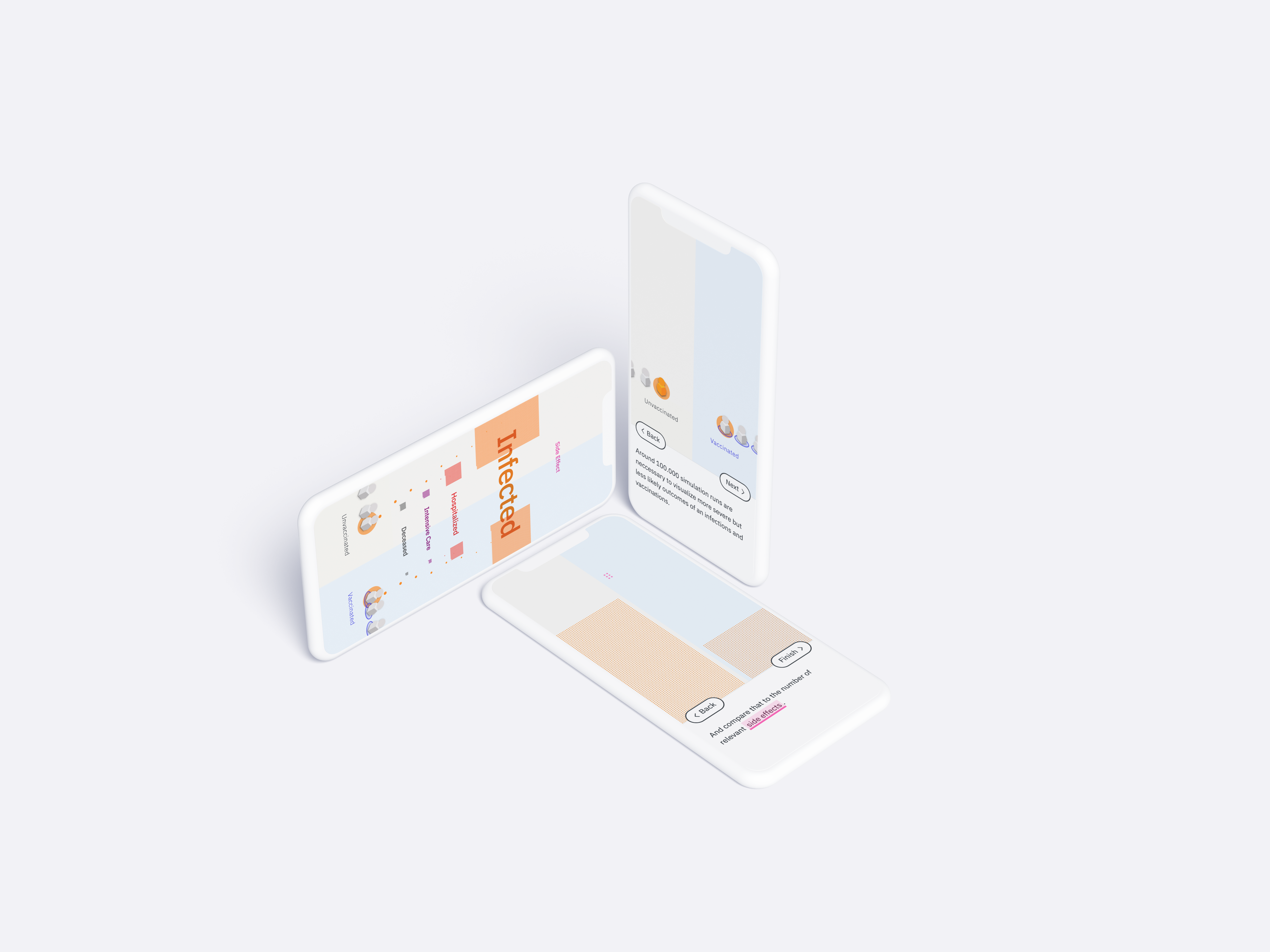
The personal perspective
How much will I benefit from vaccination? How significant are the risks of having a side effect?
To answer these questions, we created a simulation that uses the participant’s age as input and visually compares the various outcomes that stem from an exposition to the COVID-19 virus.
This simulation uses real-world statistics to calculate the probabilities.
You are the simulation
As the user scrolls down, they interactively trigger expositions to the virus, resulting in different conditions such as infection, hospitalization, or even death.
The further the user scrolls, the more expositions happen. As a result, dots of the same condition order themselves into stacks. The visualization starts to zoom out as the space for these dots gets bigger and bigger.
Comparing real world statistics
Correctly visualizing the latest COVID statistics comes with a caveat. The visualization needs to show values that are multitudes apart. That is because severe effects such as required intensive care, death, and vaccination side effects require tens of thousands of simulation runs to manifest once. Meanwhile, other less problematic outcomes, such as the chance of mild infection, require only a few simulations to happen.
The visualization closes with a summary that zooms to each outcome stack. It shows the other stack as a comparison to show the difference without distorting the ratio. This allows the users to understand how vast the difference in numbers is and how few side effects happen in 100.000 vaccinations.
The social perspective
How do vaccination-, infection- and death rates affect each other on a societal level? To understand this issue, we created an interactive crowd simulation. The participant is allowed to manipulate the vaccination rate and observe how their change affects the virus’ travel through society.
Without vaccinations viruses can easily spread in big parts of a population
This simulation applied a much simpler model and was developed in coordination with simulation experts at Max Plank Institute and Robert Koch Institute, the government’s central scientific institution in the field of biomedicine.
Cause and Effect
The social perspective applies a crowd simulation to show how vaccination rates can control the spread of COVID-19. Instead of presenting staged situations, our simulation allows users to change the vaccination rate themselves. After a change, they directly observe the vaccination rate’s drastic impact on the virus’ spreading.
The model also recognizes that some conditions—such as death and vaccination side effects—are more severe than a mild infection. These severe outcomes are therefore adequately visually highlighted.
Easy onboarding
Although both simulations tackle the same topic and apply similar visual concepts to convey information, they still require some pre-requisite introduction to each scenario.
To minimize the cognitive load on visitors, we designed an animated step-by-step onboarding that introduces visual elements, possible interactions, and each simulation scenario.
We delivered an accessible mobile-friendly micro-page allowing visitors to inform themselves interactively on the benefits and risks of a COVID-19 vaccination based on scientific data.
Credits
The project was initiated by Charité - University Medicine Berlin.
Related Case Studies
View more data visualizations and information interfaces.
Visualizing the vaccination progress against COVID-19 in Germany
Exploring the complex relationships of environmental topics
Collaborate with us
Lets find out how we can add value to your business:
Visit us
Our Studio in Berlin
Sophienstr. 18
10178 Berlin
Legal Disclaimer
Privacy Policy