Transforming Healthcare Communication: Human-centred Design in the Public Sector
The Challenge
Provide the public with accurate information about diseases so they can make informed decisions based on facts.
The Result
Enhanced health communication enabling governments to deliver essential information promptly and accurately.
Our Expertise
- Data Analysis & Visualization
- Ideation & Concept
- UX & UI Design
- Full-Stack Development
Background
The Infektionsradar emerged from the limitations of traditional health communication methods, particularly during the COVID-19 pandemic. Governments worldwide struggled to disseminate timely and accurate information to their citizens, highlighting the need for a more dynamic and user-friendly platform.
Leveraging our expertise in human-centred design and interactive data visualization, we created a systematic solution that meets the needs of users across different demographics and empowers the general public to make informed decisions about their health, thereby contributing to society's overall well-being.
Pandemic Radar App
In Numbers
Visitors per week
Data updates per week
Languages available
The Challenge
The primary challenge was to create a user-friendly dashboard that effectively caters complex health data to a broad and diverse audience. This involves underlying tasks such as:
- Creating a variety of accessible data visualisations
- Providing comprehensible explanation texts
- Streamlining the navigation and optimising for mobile devices
- Ensuring web accessibility standards
Solution Highlights
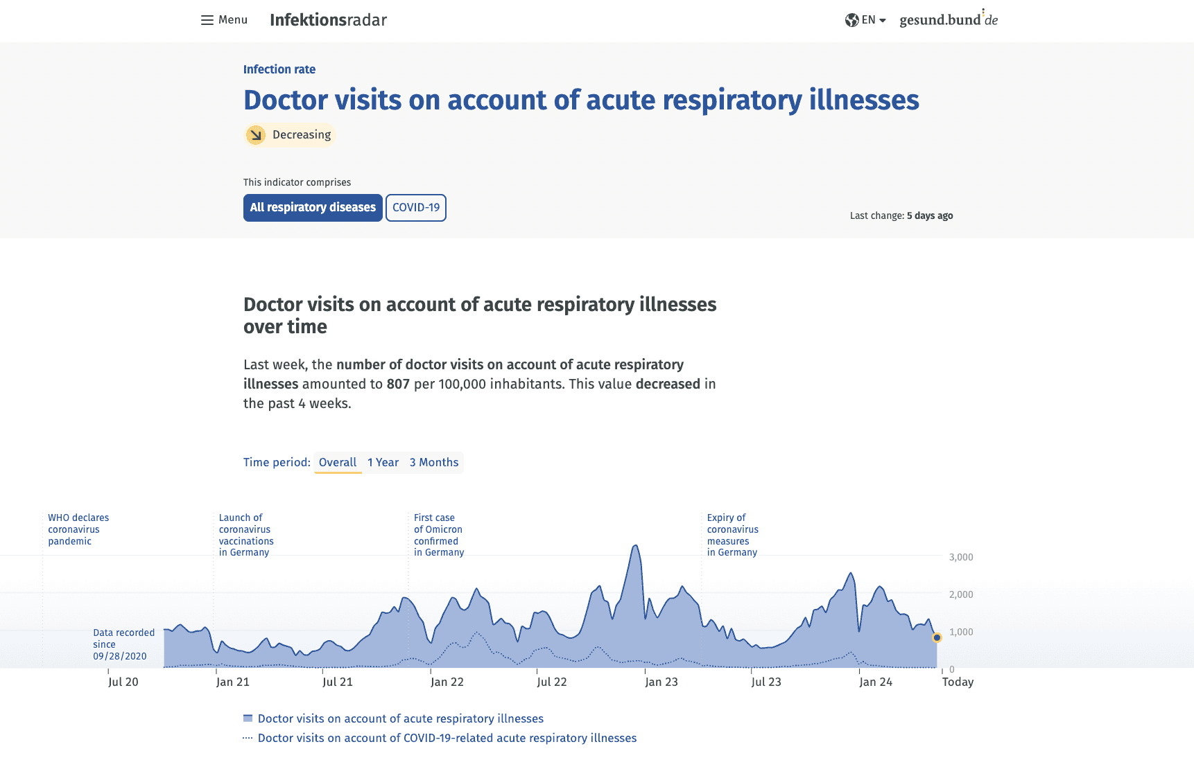
An interactive time chart together with a short explanatory text help users to effortlessly comprehend the evolution of a health indicator over time. The map and the related table empower users to gain a deeper understanding of their local situation.

Blue time chart and green map
The introduction of “trend guides” per health indicator represents a pioneering effort in public health data dashboards, providing users with valuable context to interpret the data effectively.
Trends commmunicate a prognosis of the development
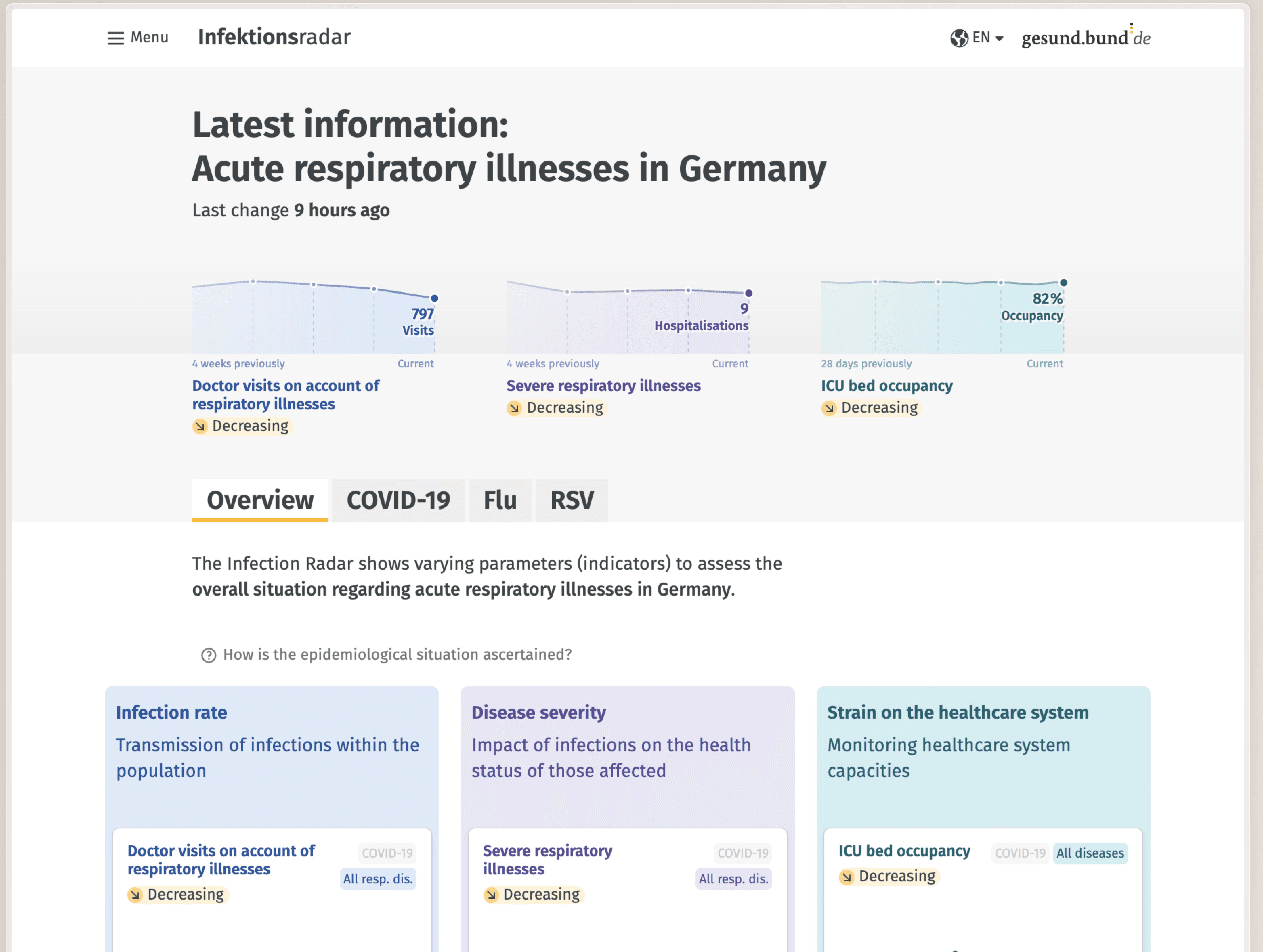
An easy-to-use navigation between diseases and health indicators is ensured, through a clearly structured layout, precise copywriting and intuitive interactions. These navigation aids were tested rigorously to ensure they met user expectations and minimised confusion, making the platform accessible and efficient for users to seek specific information.

From the landing page to specific information
Value
The data dashboard represents a groundbreaking endeavour in public health communication, addressing the critical need for accessible and comprehensive information, and fostering a more transparent and data-driven governance approach.
Through continuous user testing and iterative refinement, we successfully tailored the Infektionsradar dashboard to meet the requirements of the German Federal Ministry of Health, the Robert Koch Institute and the users.
The interactive dashboard represents a significant step forward in public health communication, empowering individuals to make informed decisions and take proactive measures to mitigate the spread of infectious diseases.
Mobile First
The majority of users visit the dashboard via mobile devices. Responsive designs followed by device and user testings, ensure that the interactive dashboard is fully optimised for mobile usage.
Credits
- Published by Federal Ministry of Health
- Comissioned by Cosmonauts & Kings